Mobile Development
Mobile UI Mistakes Beginners Make
By Yahya Saeed · 8 min read · 68 views
Mobile UI Mistakes Beginners Make
A mobile application can have powerful features, fast performance, and clean code.
But if the interface feels confusing, users may still uninstall it within minutes.
Mobile UI design is not only about making an app look beautiful. It is about helping users understand what to do, where to go, and how to complete tasks without frustration.
Beginners often focus heavily on colors, animations, and visual effects while overlooking usability, consistency, spacing, and accessibility.
The good news is that most common UI mistakes are easy to fix once you understand them.
In this guide, we will explore the mobile UI mistakes beginners make most often and how you can avoid them.
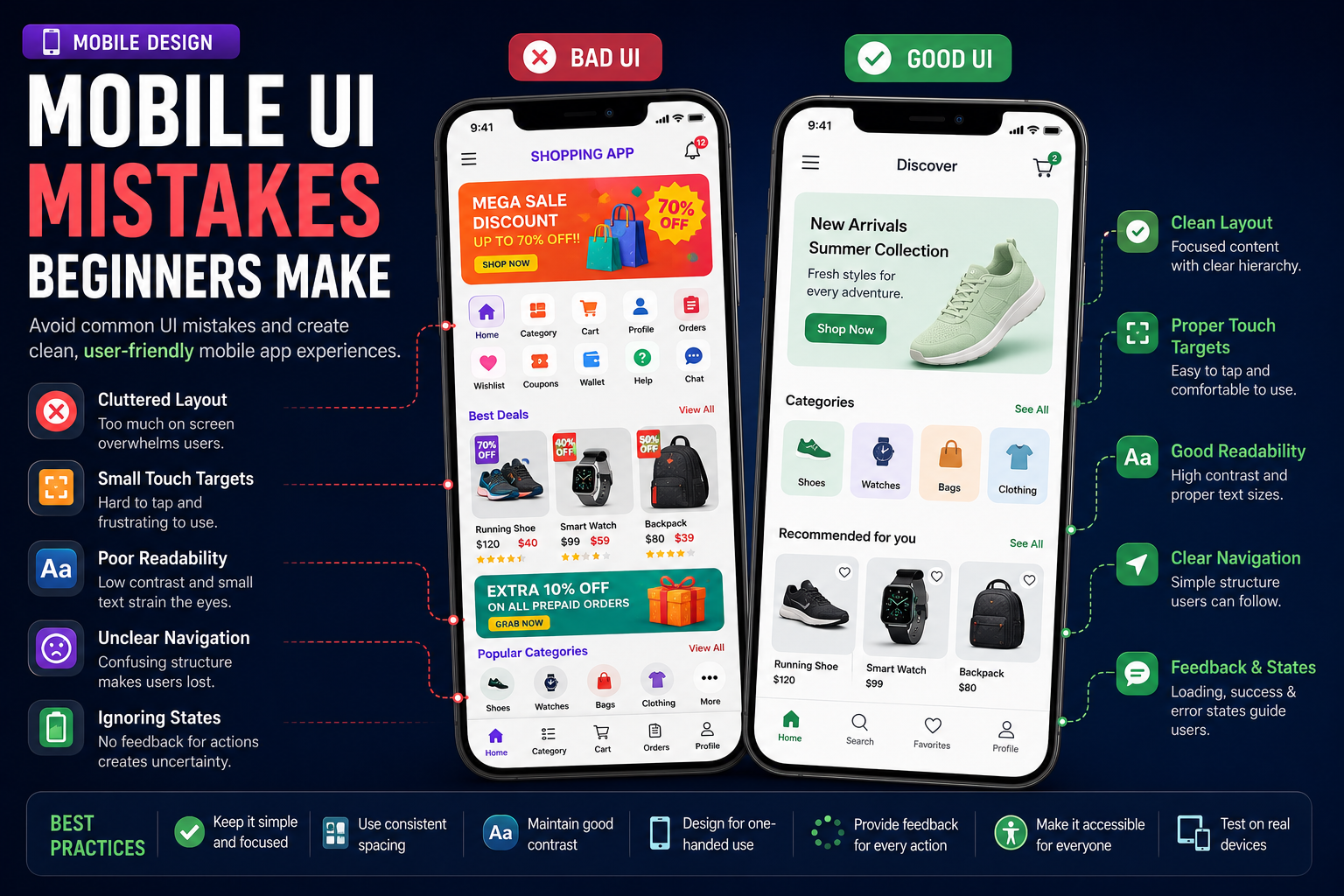
Trying to Fit Too Much on One Screen
Mobile screens are small.
Adding too many buttons, cards, menus, labels, and images to one screen makes the interface feel crowded.
Users may struggle to understand which element is most important.
A better approach is to:
Focus each screen on one main goal.
Remove unnecessary information.
Use clear visual hierarchy.
Reveal advanced options only when needed.
Simple screens are usually easier and faster to use.
Using Inconsistent Spacing
Poor spacing can make even a good design look unprofessional.
Common problems include:
Unequal margins
Random padding
Text placed too close to buttons
Cards with inconsistent internal spacing
Elements touching screen edges
Choose a spacing system and use it consistently.
For example, you might base your layout on values such as:
4 pixels
8 pixels
12 pixels
16 pixels
24 pixels
32 pixels
Consistent spacing creates rhythm and makes the interface easier to understand.
Making Buttons Too Small
Mobile users interact with their fingers, not a mouse pointer.
Small buttons are difficult to tap accurately, especially for users with larger hands or limited vision.
Make sure buttons and interactive icons have enough touchable space.
Even when an icon looks small, its touch area should be comfortably large.
Important actions should never require perfect precision.
Ignoring Visual Hierarchy
Every screen needs a clear order of importance.
Users should immediately understand:
What the screen is about
What information matters most
What action they should take next
You can create hierarchy using:
Font size
Font weight
Color
Spacing
Position
Contrast
Avoid making every element look equally important.
Using Too Many Colors
Beginners often add many bright colors because they want the app to feel exciting.
The result is usually distracting and inconsistent.
A cleaner color system may include:
One primary brand color
One secondary accent color
Neutral background colors
Success, warning, and error colors
Use color with purpose.
It should guide users, not compete for their attention.
Poor Text Contrast
Light gray text on a white background may look modern, but it can be difficult to read.
Low contrast creates problems for:
Users in bright sunlight
Older users
People with visual impairments
Users with low-quality displays
Make sure important text is easy to read in both light and dark mode.
Good design should remain usable under real-world conditions.
Using Too Many Font Styles
Mixing several fonts, weights, sizes, and letter-spacing styles makes the interface look chaotic.
Most mobile applications only need:
A heading style
A subheading style
A body text style
A small caption style
Consistency matters more than variety.
A simple typography system creates a more polished experience.
Copying Desktop Layouts Directly
A design that works on a desktop screen may not work on a phone.
Desktop interfaces often rely on:
Sidebars
Hover effects
Large tables
Multiple columns
Tiny controls
Mobile interfaces require different patterns.
Consider using:
Bottom navigation
Cards
Collapsible sections
Full-screen forms
Swipe gestures
Mobile-friendly lists
Design for the device instead of shrinking a desktop interface.
Overusing Animations
Animations can make an app feel polished, but too many animations make it slow and distracting.
Avoid:
Long transitions
Animating every element
Excessive bouncing effects
Decorative animations that delay tasks
Animations should communicate change, provide feedback, or guide attention.
They should never get in the user's way.
Hiding Important Actions
Users should not have to search for essential features.
Important actions such as:
Save
Submit
Add
Continue
Pay
Confirm
should be clearly visible.
Avoid hiding primary actions inside menus unless there is a strong reason.
Using Unclear Icons
Icons can save space, but not every symbol is universally understood.
An unfamiliar icon without a label may confuse users.
Use labels when:
The action is important.
The icon could have multiple meanings.
The audience may include beginners.
The feature is not commonly recognized.
Clarity is more important than minimalism.
Ignoring Loading States
When users tap a button and nothing appears to happen, they may tap it again.
This can create duplicate requests or confusion.
Always show feedback when the app is processing something.
Useful loading states include:
Progress indicators
Skeleton screens
Disabled buttons
Loading labels
Activity spinners
Users should always know that the app received their action.
Ignoring Empty States
What happens when a new user has no tasks, messages, transactions, or saved items?
A completely blank screen can feel broken.
A good empty state should:
Explain why the screen is empty.
Suggest the next action.
Include a clear button.
Encourage the user to get started.
For example:
No expenses yet. Add your first expense to start tracking your spending.
Showing Technical Error Messages
Users do not need to see internal errors such as:
Request failed with status code 500
Instead, show a helpful message:
We could not save your changes. Please try again.
Technical details can still be logged for developers, but user-facing messages should be clear and actionable.
Creating Long and Complicated Forms
Long forms are difficult to complete on mobile devices.
Reduce friction by:
Asking only for necessary information.
Dividing long forms into steps.
Using the correct keyboard type.
Providing sensible default values.
Supporting autofill where possible.
Showing validation close to the relevant field.
Every unnecessary field gives the user another reason to leave.
Using Placeholder Text as a Label
Placeholder text disappears when the user starts typing.
That means users may forget what a field represents.
Use visible labels above inputs, especially for important forms.
Placeholders can provide examples, but they should not replace labels.
Poor Form Validation
Validation should help users fix mistakes.
Avoid showing vague messages such as:
Invalid input
Instead, explain the problem:
Email address is required.
Password must contain at least eight characters.
Enter a valid phone number.
Amount must be greater than zero.
Clear validation saves time and reduces frustration.
Ignoring the Keyboard
The mobile keyboard can cover inputs and buttons.
Beginners often forget to test forms while the keyboard is open.
Make sure:
The focused field remains visible.
Users can dismiss the keyboard.
The submit button is still accessible.
The screen scrolls when needed.
The correct keyboard type appears.
Forms should remain usable from beginning to end.
Ignoring Safe Areas
Modern phones have notches, rounded corners, and gesture areas.
Placing content too close to screen edges can cause it to overlap with:
Status bars
Camera cutouts
Navigation gestures
Home indicators
Use safe-area components and test the app on different devices.
Using Inconsistent Navigation
Users should not have to relearn navigation on every screen.
Keep patterns consistent.
For example:
Back buttons should appear in the same location.
Tab icons should not change meaning.
Similar actions should behave the same way.
Screen titles should follow a consistent style.
Predictable navigation helps users feel confident.
Adding Too Many Navigation Tabs
Bottom navigation works best with a small number of primary destinations.
Adding too many tabs makes labels difficult to read and increases confusion.
Keep only the most important areas in the main navigation.
Less frequently used pages can live inside a menu or settings section.
Forgetting the Back Button
Android users often expect the system back button to work correctly.
Unexpected behavior can make the app feel broken.
Test navigation flows carefully, including:
Returning from detail screens
Closing modals
Exiting forms
Handling unsaved changes
Moving between nested screens
Navigation should feel natural on both Android and iOS.
Ignoring Accessibility
Accessibility should be part of the design process.
Important practices include:
Add labels for screen readers.
Use sufficient color contrast.
Support larger text sizes.
Avoid relying only on color.
Make touch targets large enough.
Maintain a logical reading order.
Accessible design improves the experience for everyone.
Not Designing for One-Handed Use
Many people operate their phones with one hand.
Frequently used actions should be reasonably easy to reach.
Important controls are often more accessible near the lower part of the screen than at the top.
However, destructive actions should be placed carefully to avoid accidental taps.
Forgetting Dark Mode
Many users prefer dark mode, especially at night.
Simply reversing black and white is not enough.
Test:
Text contrast
Card backgrounds
Borders
Icons
Images
Disabled states
Error and success colors
Both themes should feel intentionally designed.
Not Testing on Real Devices
An interface may look perfect in a simulator but feel very different on a real phone.
Real-device testing reveals problems with:
Touch target sizes
Keyboard behavior
Performance
Screen brightness
Notches
Text scaling
Different resolutions
Test on both smaller and larger devices whenever possible.
Following Trends Without Considering Usability
Not every design trend belongs in every application.
Glass effects, oversized text, hidden navigation, and complex gestures may look impressive, but they can reduce usability.
Before using a trend, ask:
Does it make the app easier to use?
Does it support the app's purpose?
Will users understand it?
Does it work well on budget devices?
A practical interface is better than a fashionable but confusing one.
A Simple Mobile UI Checklist
Before publishing your app, review these questions:
Is each screen focused on one goal?
Is the text easy to read?
Are buttons large enough to tap?
Is spacing consistent?
Are important actions clearly visible?
Are loading and empty states included?
Are forms simple and properly validated?
Does navigation behave consistently?
Does the interface work in dark mode?
Have you tested it on real devices?
Is the app accessible?
This checklist can help you catch many problems before users do.
Final Thoughts
Great mobile UI design is not about adding more.
It is about removing confusion.
Users should be able to open your app, understand the interface, and complete their tasks without needing instructions.
As a beginner, focus on clarity, consistency, spacing, readable text, and predictable navigation before worrying about advanced visual effects.
Beautiful designs may attract users, but usable designs keep them.
The best mobile interfaces feel simple not because they were easy to create, but because the designer carefully removed everything that stood between the user and their goal.
Keep reading
Related Posts

Mobile Development
How Mobile Apps Make Money
Building a great mobile app is only half the journey. Understanding how apps generate revenue is equally important. From advertising and subscriptions to in-app purchases and sponsorships, discover the most effective ways mobile apps make money in 2026.
5 min read · 125 views
Mobile Development
React Native Performance Tips
A fast and responsive app keeps users engaged, while a slow one drives them away. Learn the best React Native performance optimization techniques every developer should know to build smooth, efficient, and production-ready mobile applications in 2026.
5 min read · 113 views
Mobile Development
Publishing Your First App on the Play Store
Publishing your first Android app is an exciting milestone for every developer. From preparing your app and generating an Android App Bundle to creating your Play Console listing and passing Google's review process, this guide walks you through every step of publishing your first app on the Google Play Store in 2026.
4 min read · 92 views
Trending
Popular Posts
Productivity Tools That Save Developers Hours in 2026
681 views
The Most Valuable Skills to Learn in the AI Era (2026 and Beyond)
331 views
Vibe Coding vs Learning to Code: Which Path Will Take You Further?
277 views
Next.js 16 Features Every Developer Should Know in 2026
192 views
The Best Folder Structure for Next.js Projects in 2026
152 views
Comments
No approved comments yet.